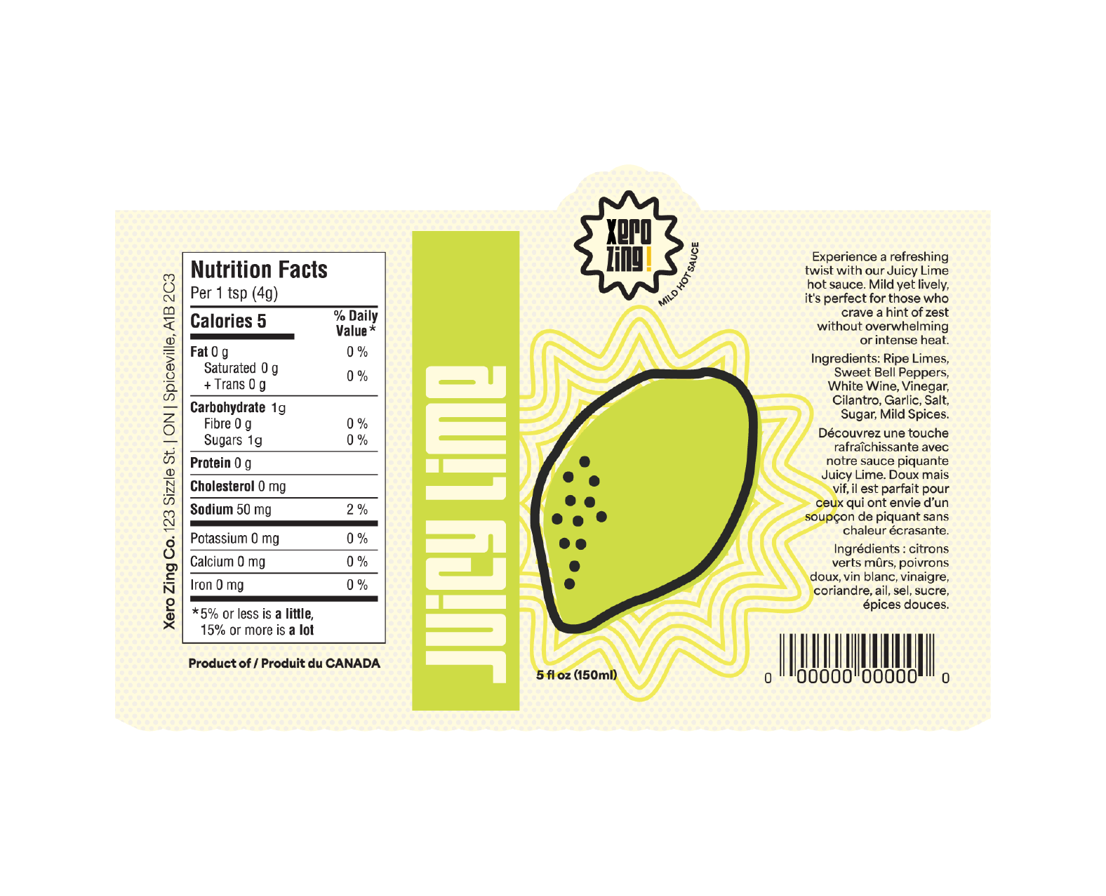
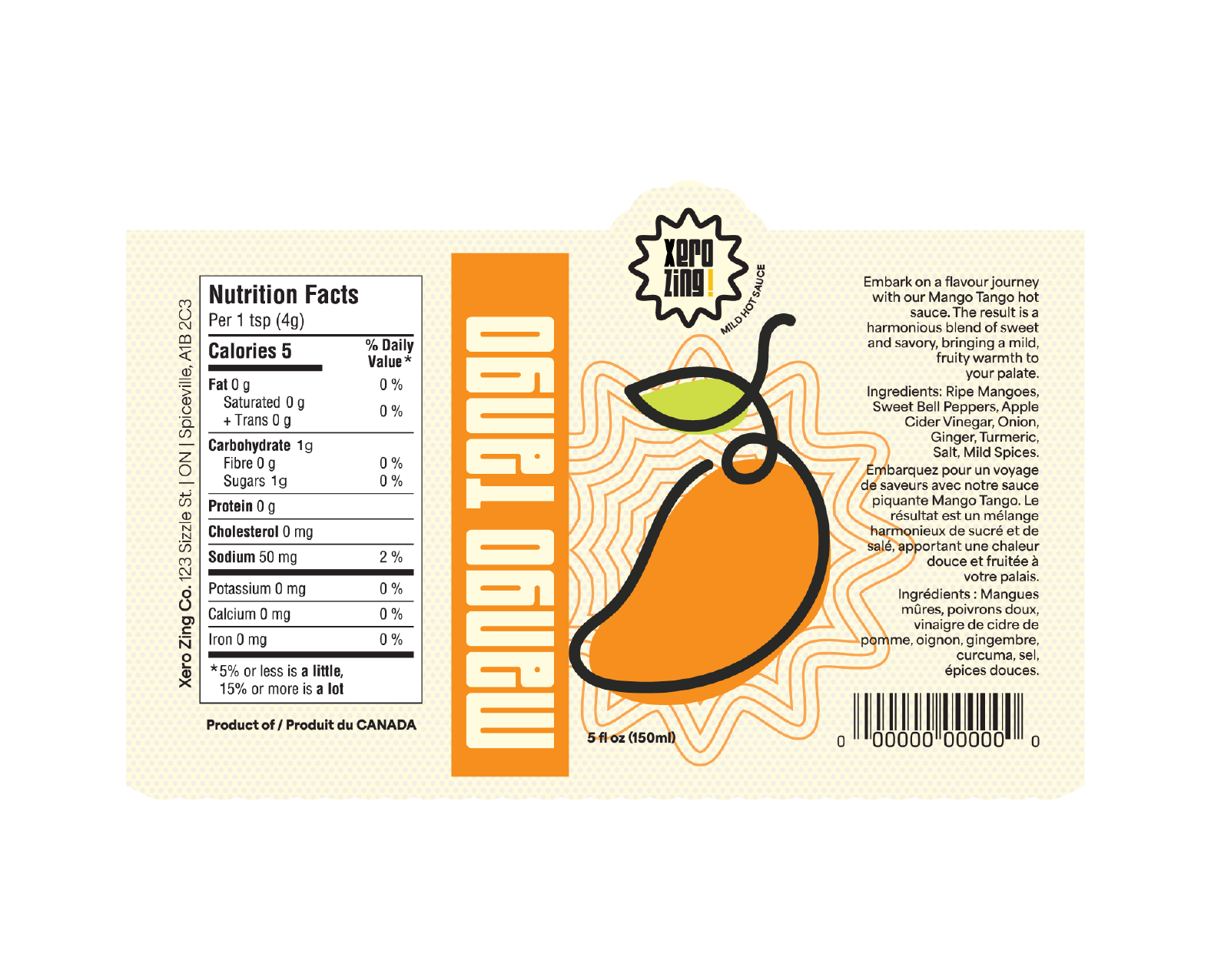
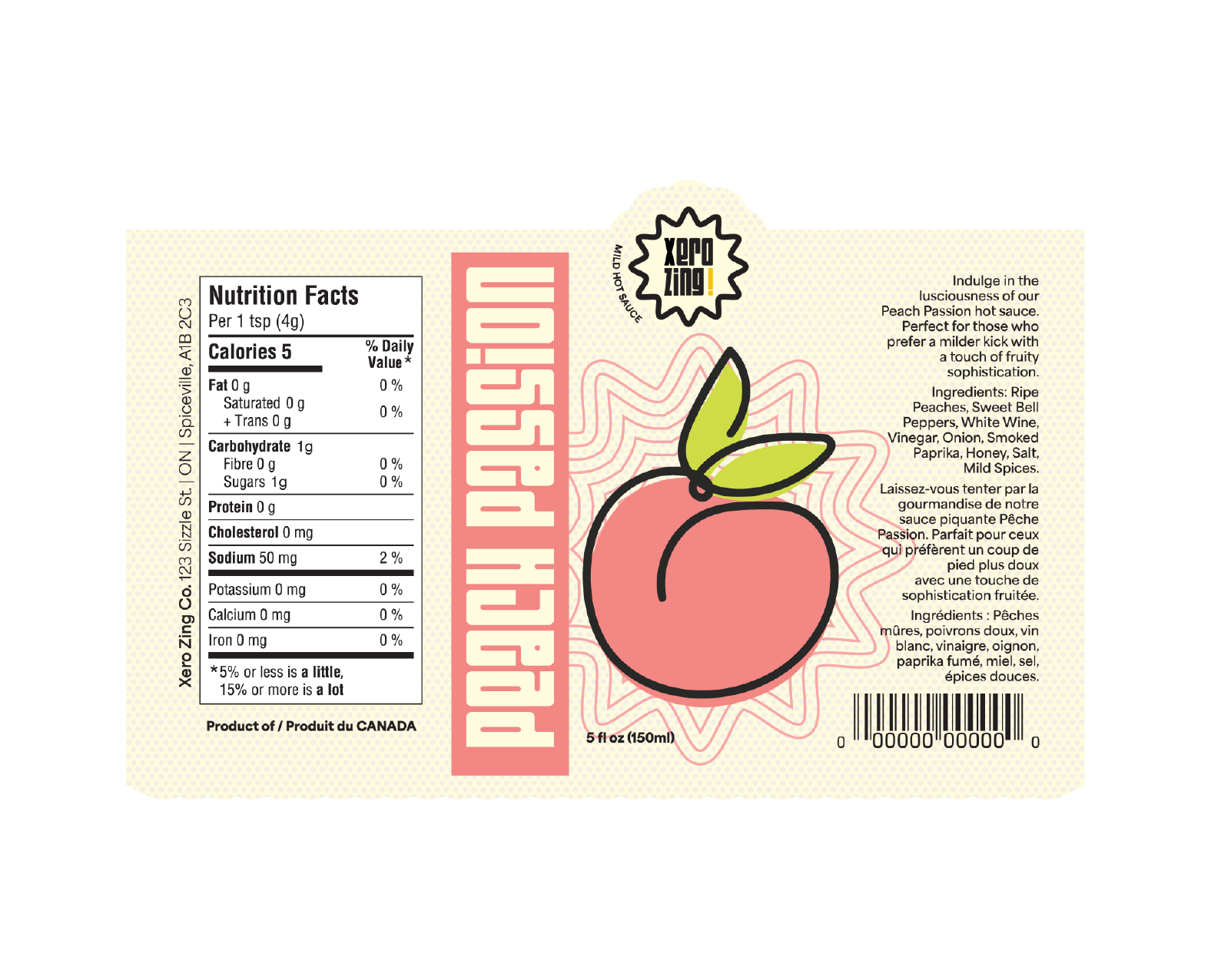
Xero Zing is a unique line of mild/no-spice hot sauce designed for individuals seeking flavour without the intensity of heat. Drawing inspiration from hand drawings, playful patterns, and halftones, the brand embraces a fun colour palette and cute illustrations, ensuring that its bottles stand out on crowded shelves, and capture the attention of shoppers.
The logo along with the carefully selected colour palette, plays a pivotal role in the brand's identity. The three colours represent distinct flavours within the Xero Zing line. Crafting these elements required attention to detail and a keen understanding of visual aesthetics to create a cohesive and eye-catching design.
Despite the challenge of incorporating extensive copy, particularly in accommodating French language requirements, the project was an enjoyable journey that resulted in a satisfying outcome. The Xero Zing brand encapsulates both creativity and functionality, offering a delightful hot sauce experience for those who prefer flavour without the heat, including individuals like myself who typically shy away from spicier options.
Software used:
Illustrator | Dimension


